
What is a card making colour scheme? Your guide
TL;DR:
- A card-making colour scheme uses two or three harmonious colors chosen based on color theory principles. Experts recommend limiting to three main colors, with neutrals providing visual balance and clarity. Using prepared palettes, testing on scrap, and maintaining consistent temperature help create balanced, impactful handmade cards.
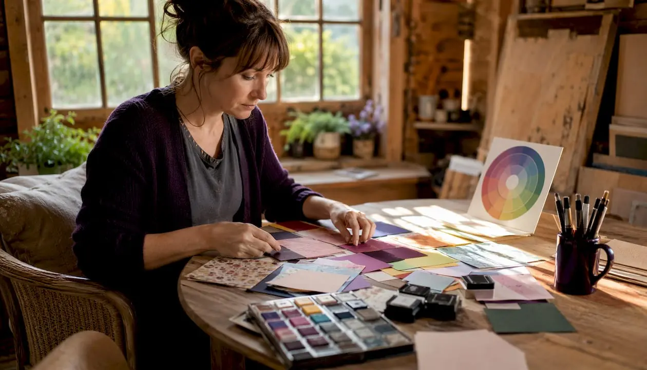
A card-making colour scheme is an intentional selection of two or three colours chosen to work together harmoniously on a handmade card. The simplest formula you can copy right now: neutral base + one family colour + one accent. Try it with cream cardstock, soft sage green, and a touch of gold. That three-colour combination works for almost any occasion and takes under a minute to decide.
- Neutral base: white, cream, kraft, or grey cardstock
- Family colour: the dominant hue that sets the mood (sage, navy, dusty rose)
- Accent: a small pop of contrast or metallic (gold, coral, deep plum)
Expert card makers recommend limiting a palette to a maximum of three main colours to avoid visual chaos. The proportions often recommended for those colours are dominant, secondary, and accent in decreasing order, such as allocating most to the dominant colour, less to the secondary, and the smallest amount to the accent.
Table of Contents
- What are the main colour scheme types for card making?
- Ready-made palette recipes you can copy straight away
- How to choose and apply a colour scheme step by step
- How papers, inks, and collections affect your colour choices
- Common colour mistakes and how to fix them quickly
- Tools and resources that make palette choices easier
- Key takeaways
- Why neutrals are the most underrated tool in your palette
- Practise palette work with ready-made kits from Craftsuprint
- Useful sources and further reading
- FAQ
What are the main colour scheme types for card making?
Colour theory describes the relationships between colours and their emotional effects. For card makers, four scheme types cover almost every situation.
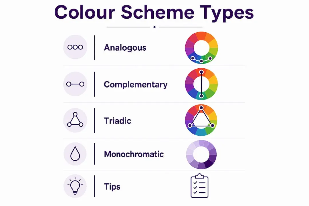
Analogous schemes use colours that sit next to each other on the colour wheel: blue, teal, and green, for example. They feel calm and cohesive, which makes them ideal for sympathy cards, nature themes, or anything that needs a gentle, restful quality.
Complementary schemes pair colours from opposite sides of the wheel, such as purple and yellow or red and green. The contrast is bold and energetic. Use this for birthday cards, celebrations, or any design where you want something to jump off the page.
Monochromatic schemes work within a single hue, using its tints (lighter versions), shades (darker versions), and tones. A card built entirely from dusty blues reads as polished and elegant. It is also the easiest scheme to get right because the colours cannot clash.
Triadic schemes pick three colours evenly spaced around the wheel, such as red, yellow, and blue. Vibrant and playful, they suit children’s cards and festive designs. The catch is that triadic palettes need careful proportion work to avoid looking chaotic.
- Analogous: calm, harmonious, great for nature and sympathy themes
- Complementary: bold contrast, perfect for celebrations
- Monochromatic: elegant and foolproof, ideal for beginners
- Triadic: lively and festive, requires careful proportion control
Pro Tip: Keep your palette mostly warm or mostly cool. Accidentally mixing warm and cool tones without intent is one of the most common reasons a card feels subtly ‘off’. If you pick a warm cream base, choose warm greens and warm reds to match.
Ready-made palette recipes you can copy straight away
These three-colour recipes are designed to be used immediately. Each one names the mood, the colours, and a quick note on where to place them. For seasonal and creative card themes, the occasion column points you in the right direction.
| Palette name | Dominant (60%) | Secondary (30%) | Accent (10%) | Best for |
|---|---|---|---|---|
| Classic celebration | White | Cobalt blue | Gold | Birthdays, congratulations |
| Soft garden | Cream | Dusty sage | Blush pink | Thank you, spring cards |
| Warm festive | Kraft | Deep red | Copper | Christmas, autumn |
| Elegant mono | Pale grey | Mid grey | Charcoal | Sympathy, wedding |
| Fresh citrus | White | Coral | Lime green | Summer, children’s cards |
| Coastal calm | Cream | Soft teal | Navy | Seaside, travel, get well |
| Berry luxe | White | Deep plum | Rose gold | Anniversary, feminine birthday |
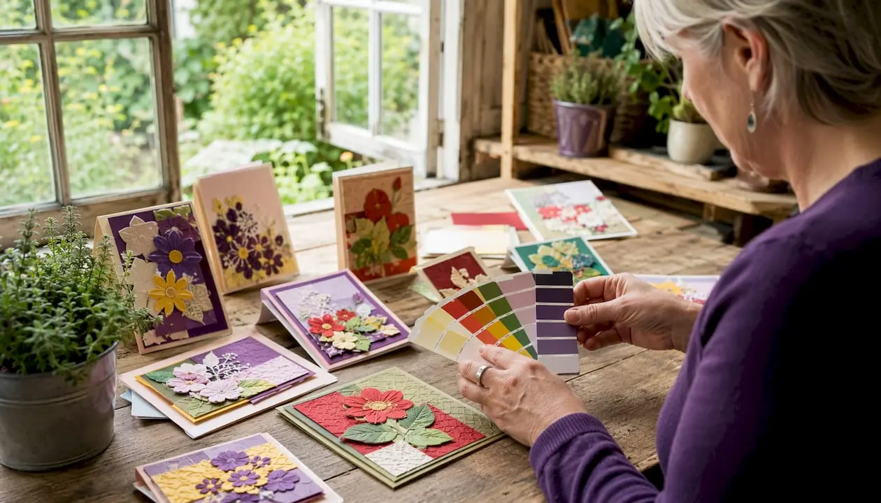
To visualise these before you commit, cut small squares of your actual papers and lay them side by side on your desk. A quick mock-up on scrap card takes two minutes and saves a ruined sheet. Store successful combinations in a small notebook or on a metal ring with punched card samples so you can reach for them again next time.
Pro Tip: When building a palette from a patterned paper, pull your cardstock and ink colours directly from the print. The designer has already done the colour work for you.
How to choose and apply a colour scheme step by step
Choosing colours is a process, not a talent. Follow these steps and you will have a working palette before you pick up a single stamp.
- Decide the mood first. Ask: should this card feel calm, joyful, elegant, or playful? Mood narrows your colour temperature before you touch the wheel.
- Choose your dominant colour. This will cover roughly 60% of the card surface, usually the base cardstock. Pick something that matches the mood.
- Open a colour wheel and find your scheme type. Analogous for harmony, complementary for contrast, monochromatic for elegance. Select one or two supporting colours.
- Check the temperature. Are all three colours warm, or all cool? If not, decide whether the contrast is deliberate. If it is not, swap one colour to match the temperature of the others.
- Test tones on scrap paper. Lay your cardstock, ink, and patterned paper together before you cut anything. Colours shift under different lighting, so check near a window.
- Apply the 60-30-10 rule. Assign your dominant colour to the base layer, your secondary to panels or matting, and your accent to small details, sentiments, or embellishments.
- Check contrast for legibility. Your sentiment or greeting must be readable. Dark text on a light background, or vice versa, is the safest rule. If the contrast feels weak, swap the sentiment layer to your darkest colour.
Committing to the palette before you choose stamps or dies reduces rework significantly. Successful makers select swatches first and build the card around the tones, rather than the other way around. For more practical finishing tips, the paper crafting tips guide on the Craftsuprint blog covers application techniques in detail.

How papers, inks, and collections affect your colour choices
The same colour looks different depending on what it is printed or stamped on. A warm ivory cardstock makes every colour sitting on top of it read warmer. A bright white base pushes colours cooler and crisper. This is not a minor detail: it is the reason a palette that looks perfect on screen can feel slightly wrong once you have cut and layered it.
- Paper finish matters. Matte card absorbs ink and softens colours. Glossy or pearlescent card reflects light and intensifies them. Textured card breaks up flat colour and adds depth.
- White vs cream base. A cream or kraft base suits warm palettes (reds, oranges, warm greens). A bright white base suits cool palettes (blues, purples, cool greys). Mixing a cream base with cool colours is a common source of that ‘something is off’ feeling.
- Coordinated collections reduce guesswork. Retail coordinated systems group inks, cardstock, and patterned paper by colour family, keeping warmth and undertones consistent across every element. For UK crafters, these collections are available from several major suppliers and are worth using when you are learning.
- Mixing collections. When you combine papers from different ranges, check the undertones. Hold them together in natural light. A green with a yellow undertone and a green with a blue undertone will clash even if both are labelled ‘sage’.
For guidance on choosing patterned papers that already coordinate, the Craftsuprint blog’s card patterns guide explains how to read a range before you buy.
Pro Tip: Always stamp a test swatch on the actual paper you plan to use. Ink behaves differently on coated, uncoated, and textured surfaces. A colour that looks rich on smooth white card can appear faded on kraft.
Common colour mistakes and how to fix them quickly
Most colour problems on handmade cards come down to a small number of recurring errors. Each one has a fast fix.
- Too many colours. The card looks busy and nothing stands out. Fix: reduce to two or three colours and use neutrals to fill the gaps.
- Warm and cool clash. The palette feels subtly wrong but you cannot identify why. Fix: identify the temperature of your base card and swap any outlier colour to match it.
- Weak contrast. Layers blend together and the design loses definition. Fix: add a strip of white or black between layers to create a visual break.
- No breathing room. Every layer is a saturated colour and the eye has nowhere to rest. Fix: neutrals such as white, cream, kraft, grey, and black function as essential visual breathing room. Add a white mat or a kraft panel to calm the design.
- The sentiment disappears. The greeting text is hard to read because it sits on a mid-tone background. Fix: stamp or print sentiments on your lightest or darkest layer only.
- Colours that looked good separately clash together. Fix: check undertones. Two greens, two pinks, or two neutrals can clash if one is warm-toned and the other is cool-toned.
After assembling a card, step away for five minutes and look at it again with fresh eyes. What felt balanced while you were building it often reveals an obvious imbalance from a distance. A quick photograph on your phone also helps: the small screen flattens the design and makes proportion problems visible immediately.
Tools and resources that make palette choices easier
You do not need to build every palette from scratch. Several tools exist specifically to speed up colour selection and push you beyond your habitual combinations.
- A physical colour wheel. The classic tool for understanding scheme types. Keep one at your workbench and use it to check relationships before committing.
- Designer series paper and coordinated collections. Curated colour tools such as designer series paper and coordinated ink/cardstock collections speed selection and move you beyond habitual combinations. The designer has already resolved the undertone and temperature decisions.
- Palette scout decks and colour cube tools. Physical card decks that show pre-built palettes. Particularly useful when you want to try colour combinations you would not normally reach for.
- Digital palette generators. Free browser-based tools let you input a base colour and generate analogous, complementary, or triadic options instantly. Useful for planning before you buy supplies.
- Downloadable mini kits and templates. Pre-coordinated kits that include matching papers, sentiment layers, and embellishment suggestions take the palette decision out of the equation entirely. Craftsuprint’s craft supplies section lists coordinated kits and tools suited to UK crafters, and the platform’s ‘Create your card’ tool lets you practise palette choices digitally before printing.
- A swatch notebook or ring. Cut small squares of every cardstock and patterned paper you own and store them on a metal ring or in a small notebook. When you need a palette, you can pull physical swatches and lay them together rather than hunting through full sheets.
For a broader list of UK-friendly supply sources, the top craft supply resources guide on Craftsuprint covers where to find coordinated ranges in the UK market. For mood-driven palette inspiration drawn from art and photography, the colour and art styling guide at CaliCuration is worth bookmarking.
Key takeaways
A card-making colour scheme works best when it uses two to three colours in deliberate proportions, with neutrals providing the visual breathing room that lets focal colours read clearly.
| Point | Details |
|---|---|
| Limit your palette | Use two to three colours maximum; more than three usually creates visual chaos. |
| Apply 60-30-10 | Assign 60% to your dominant colour, 30% to secondary, and 10% to your accent. |
| Use neutrals deliberately | White, cream, kraft, and grey are not fillers; they give focal colours room to breathe. |
| Match colour temperature | Keep your palette mostly warm or mostly cool to avoid a subtle ‘off’ feeling. |
| Craftsuprint for ready-made palettes | Craftsuprint’s downloadable kits and coordinated collections let you practise palette work without building from scratch. |
Why neutrals are the most underrated tool in your palette
Most card makers focus on the ‘colour’ colours: the bold blues, the warm reds, the pretty pinks. Neutrals get treated as background filler, something to use when you run out of ideas. That is the wrong way to think about them.
Neutrals are structural. A strip of white between two saturated layers does not just look clean; it stops the colours from fighting each other and lets each one read as intended. Kraft card does the same thing with warmth, grounding a palette that might otherwise feel too sweet or too sharp. When a card feels busy or unresolved, the fix is almost always to add a neutral, not to swap a colour.
The habit I find most useful is committing to the palette before touching a single stamp or die. Pull three physical swatches, lay them on your desk, and live with them for a moment. If the combination feels right at that stage, it will feel right on the finished card. If something is nagging at you, fix it now rather than after you have cut and layered everything. A small notebook of successful swatch combinations, built up over time, becomes one of the most useful things at your workbench.
Practise palette work with ready-made kits from Craftsuprint
Knowing the rules is one thing. Having the right materials in front of you is another. Craftsuprint’s downloadable card making kits give you pre-coordinated colour palettes, printable paper layers, and step-by-step templates in a single download, so you can practise the 60-30-10 rule and scheme types on a real project rather than a blank sheet of card.
Each kit includes matching papers, sentiment layers, and embellishment guides, all colour-matched so the undertone and temperature decisions are already resolved. Downloads are instant, which means you can be printing and cutting within minutes of purchase. Browse the paper crafts section to find coordinated kits suited to your next project, or visit Craftsuprint’s craft supplies to explore the full range of tools and materials available to UK crafters.
Useful sources and further reading
- Beginner’s guide to colour combinations for cardmaking, Card Palettes — a clear introduction to scheme types with card-specific examples; good starting point for beginners.
- Color confidence for card makers, The Kind Card Maker — practical advice on limiting palettes, using neutrals, and the neutral + family + accent formula.
- 5 proven tips for easy card colour combination, Altenew blog — explains the 60-30-10 rule in a card-making context with visual examples.
- How to choose card making colour combinations, Design With Jo — covers warm/cool temperature guidance and coordinated tools; useful for intermediate crafters.
- Cardmaking with a palette scout, RC Kinsmon Studio — shows how starting from a palette rather than a stamp set reduces decision fatigue.
- Colour scheme, Wikipedia — a reliable reference for the definitions of analogous, complementary, monochromatic, and triadic schemes.
- Craftsuprint — downloadable kits, coordinated palettes, and a ‘Create your card’ tool for practising palette choices on real projects.
FAQ
What is a card-making colour scheme?
A card-making colour scheme is a deliberate selection of two to three colours chosen to work harmoniously together, typically guided by colour theory principles such as analogous, complementary, or monochromatic relationships.
What are the four main types of colour scheme?
The four types used most in card making are analogous (neighbouring colours on the wheel), complementary (opposite colours), monochromatic (tints and shades of one hue), and triadic (three evenly spaced colours). Each suits a different mood or occasion.
How many colours should I use on a handmade card?
Most experienced card makers recommend two to three colours as the sweet spot. More than three tends to create visual chaos; the 60-30-10 rule helps you assign proportions once you have chosen your palette.
What is the purpose of a colour scheme on a card?
A colour scheme creates visual harmony, guides the viewer’s eye, and sets the emotional tone of the card. Without one, colours compete rather than work together, and the design feels unresolved.
How do I stop my card colours from clashing?
Check colour temperature: keep your palette mostly warm or mostly cool. Add a neutral such as white, cream, or kraft to give saturated colours breathing room, and test your swatches on the actual paper you plan to use before cutting.