
Save Ink on Craft Printables in 7 Steps Without Losing Design Quality
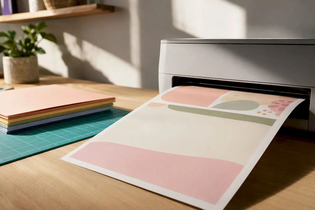
Set your printer to draft or a low quality mode, switch text-heavy pages to grayscale, and lay out multiple designs per sheet before you press print. Those three changes alone can cut ink use dramatically on most craft projects. Ecofont-style pixel removal can shave off up to 28% more on top of that. Some tutorials build these habits into downloads, so the checklist below turns the theory into something you can run through in five minutes.
TL;DR:
- Using draft or low-resolution modes, combined with grayscale printing and optimized layouts, can significantly reduce ink consumption during printing.
- Selecting light, thin fonts like Century Gothic or Times New Roman, along with Ecofont-style types, can decrease ink use on text-heavy designs without sacrificing readability if tested beforehand.
- Proper layout planning, such as fitting multiple designs per sheet and avoiding full-bleed backgrounds, prevents unnecessary ink use on blank margins and large color fills.
- Coated or low-absorbency paper stock enhances color density at lower ink levels, allowing for lighter settings without losing visual impact on finished projects.
- Careful maintenance practices, like checking nozzle performance before cleaning and avoiding cartridge re-insertion, help prevent ink waste and cartridge early depletion.
Table of Contents
- How to reduce ink usage on printables: a 7-step checklist
- Printer settings that have the biggest effect
- Fonts and Ecofont-style methods for lower ink coverage
- Layout and file prep: fewer wasted pages, less wasted ink
- Paper and media choices that make ink look stronger
- Maintenance and cartridge handling that avoids waste
- Subscription and recycling options worth knowing about
- Craftsuprint tools that help you print smarter
- Adjusting saturation and contrast to cut unnecessary ink deposition
- Choosing lighter clip art instead of heavy solid fills
- Turning colour printables into monochrome without losing clarity
- When not to chase ink savings
- Print low-ink designs without the extra prep work
- Sources
- FAQ
How to reduce ink usage on printables: a 7-step checklist
Run through these before your next batch print. Doing two or three together, rather than one in isolation, is where the real savings show up.
- Set draft or low-resolution mode in your printer driver for anything that isn’t a final piece.
- Print one test sheet first. Use print preview, then proof that single page before running the full batch.
- Switch to grayscale or black-only for text-heavy elements, sentiments, and instructions.
- Pick ink-efficient fonts or run Ecofont-style processing on PDFs dominated by small text.
- Use n-up layout to fit several designs per sheet, and avoid full-bleed colour backgrounds.
- Duplex where the project allows it, especially inserts, tags, and multi-page kits.
- Choose coated or lower-absorbency stock so colours sit on top instead of soaking in.
Add one more habit: don’t yank cartridges out to check ink levels. Each reinsertion can trigger a reliability check that quietly uses ink you didn’t plan to spend.
Printer settings that have the biggest effect
Draft mode (sometimes labelled “EconoMode,” “fast,” or “low quality”) lays down less ink per pass. For a card sentiment, a tag, or a scrapbook filler page nobody will scrutinise up close, it’s usually indistinguishable from standard quality once trimmed and mounted. Save the higher settings for the actual focal image.
Grayscale and selective colour work differently depending on your driver. Some let you print the whole page in black only; better drivers let you keep one embellishment in colour while everything else defaults to black. That’s worth hunting for if your design mixes a coloured motif with plain text.
Duplex printing saves ink as well as paper, because you’re not running a second sheet through the machine for the back of an insert or a two-sided tag. It won’t help every project, but for multi-page kits it adds up fast.
Most of these options don’t live in the main print dialog. Check your driver’s Quality & Media and Maintenance tabs, where manufacturers tend to bury draft density controls and diagnostic tools.
Pro Tip: Before you touch the cleaning function, run a nozzle check. If the test page prints clean lines with no gaps, cleaning does nothing but waste ink you didn’t need to spend.
Fonts and Ecofont-style methods for lower ink coverage
Font choice matters more than most hobbyists assume, especially on text-heavy printables like recipe cards, planner inserts, or sentiment strips.
- Century Gothic and similar geometric sans-serifs use thinner strokes than bolder fonts, cutting coverage without hurting legibility.
- Times New Roman and other serif fonts with fine strokes also print lighter than heavy sans-serif alternatives.
- Ecofont-style typefaces remove tiny interior sections of each letter that print but the eye doesn’t register, dropping ink use while the glyph still reads normally at typical sizes.
A study published in Sustainability (MDPI) measured reductions from pixel-removal fonts ranging from roughly 12% up to 39%, depending on the specific typeface and how aggressively the pixels were stripped. That’s a wide range, and it matters which end of it you land on.
The catch: pixel removal starts to hurt legibility once you drop below around 10 point on fine-detail work, like tiny labels on a mini kit or intricate lettering on a tag. If your craft printable depends on small, crisp text, test a sample sheet before committing a whole batch to an Ecofont conversion.
Layout and file prep: fewer wasted pages, less wasted ink
Getting the layout right before you print saves more ink than any single driver setting, because it stops you covering blank margins with colour you’ll trim off anyway.
- Arrange multiple designs per sheet (n-up layout) instead of printing one card or tag per page.
- Swap large solid-colour backgrounds for patterns, lower-opacity fills, or outlined shapes where the design allows it.
- Use crop or trim marks and check alignment on one test print before committing to a full run.
Craftsuprint’s guide to resizing printables correctly walks through scaling designs to fit a template grid, which is exactly the kind of prep that turns four wasted sheets into one efficient one.
Paper and media choices that make ink look stronger
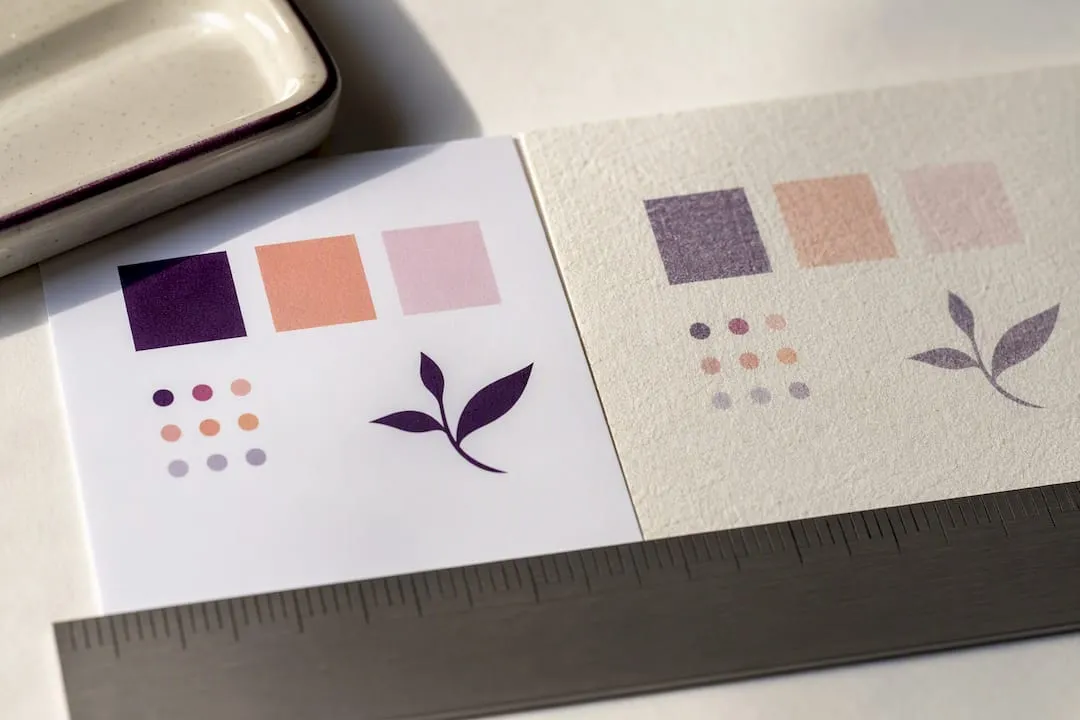
Coated or semigloss stock holds ink on the surface rather than letting it soak into the fibres, so colours look denser and more saturated at a lower ink setting than the same design would on plain bond paper. That matters most for the finished card front; for filler pages, inserts, or anything that gets folded inside a kit, cheaper uncoated stock does the job fine.
Test one sample sheet at your usual settings, then lower the density or saturation slightly and compare. Heavier coated card stock often lets you drop the ink setting a notch and still get a result that looks fuller than an uncoated equivalent at full strength.
Maintenance and cartridge handling that avoids waste
Manufacturer manuals are consistent on this point: run a nozzle check before you clean, and only clean the print head when that check actually shows missing or broken lines. Cleaning cycles use a surprising amount of ink, and running them “just in case” is one of the most common ways hobbyists burn through a cartridge early.
- Run a nozzle check first; skip cleaning if the test page is clean.
- Avoid removing and reinserting cartridges repeatedly, since each reinsertion can prompt a reliability check that uses ink.
- Store spare cartridges upright, in their sealed packaging, away from heat.
- Keep the printer’s driver software updated so maintenance routines run as intended.
Once a cartridge is genuinely empty, UK guidance under waste exemption T16 sets out how toner and ink cartridges can be sorted, cleaned, and treated for reuse, rather than binned outright.
Subscription and recycling options worth knowing about
If you print craft projects several times a week, a page-based subscription can change the maths. HP Instant Ink charges a low monthly fee for a set page allowance with unused pages rolling over, which suits frequent crafters better than buying cartridges piecemeal. Occasional printers, by contrast, usually do better sticking with standard cartridges.
For recycling, manufacturer programmes like HP Planet Partners and Renew by Brother both take back empty cartridges for closed-loop processing. If you print in a shared workshop or community craft space, print-management tools like PaperCut can enforce grayscale and duplex defaults automatically, which does more for group-wide ink use than relying on everyone remembering to change settings themselves.
Craftsuprint tools that help you print smarter
Craftsuprint’s tutorials build low-ink habits directly into the download process, so you’re not fighting settings after the fact. The DPI guide for printables explains when 150 DPI is genuinely fine rather than defaulting to 300 for everything, and the printer settings guide for card printables covers driver tweaks that stop smudges and reprints on card stock specifically. Pre-optimised downloads cut reprints because the file is already sized and trimmed correctly before it reaches your printer.
Adjusting saturation and contrast to cut unnecessary ink deposition
Most print drivers hide a density or saturation slider somewhere in the advanced colour settings, and it’s one of the least-used tools in the whole ink-saving toolkit. Dropping saturation by 10 to 15% rarely changes how a design reads once it’s trimmed, mounted, and viewed at normal distance, but it noticeably reduces the volume of ink laid down per page.
Contrast settings work alongside this. High-contrast images, ones with sharp jumps between very dark and very light areas, tend to demand more ink at the dark end to render properly. Pulling contrast back slightly softens that demand without making the design look washed out, particularly on backgrounds and borders rather than focal motifs.
The trick is doing this selectively rather than globally. A drop shadow or a deep shaded border rarely needs full ink density to look convincing on paper; a focal flower or a sentiment does. If your driver supports it, apply a saturation reduction to the whole document and then manually restore full density to the one or two elements that actually need to pop.
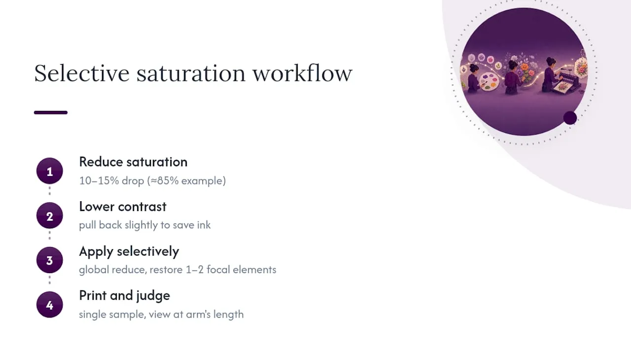
Test this the same way you’d test any driver change: print one sample, hold it at arm’s length, and judge whether it reads correctly once trimmed. A design that looks slightly flat on screen at 85% saturation often looks completely normal once printed, because paper absorbs and diffuses ink differently to a backlit display. This is one of the quickest wins in the whole checklist because it requires no design changes at all, just a slider adjustment before you print.
Choosing lighter clip art instead of heavy solid fills
The single biggest driver of ink use on a craft printable often isn’t the text, it’s the graphics. A solid-filled illustration, a heavy drop shadow, or a densely shaded clip art motif can use several times the ink of a line-art equivalent covering the same area on the page.
Line art, outline-style illustrations, and clip art with lighter fills give you nearly the same visual impact for a fraction of the ink. A hand-drawn-style flower outline with a thin coloured border reads just as clearly on a card front as a fully shaded, gradient-filled version, especially once it’s surrounded by white space and other design elements.
When you’re browsing designs to buy or download, look specifically for:
- Line-art or outline-style graphics rather than fully rendered, shaded illustrations.
- Clip art with flat, lighter colour fills instead of gradients or deep shadow effects.
- Designs that use negative space (the paper itself) as part of the artwork, rather than filling every area with colour.
This matters most on projects with multiple graphic elements, like scrapbook layouts or multi-motif cards, where the cumulative ink use across five or six heavy images adds up fast. Swap even two or three of those for lighter alternatives and the difference across a full print run is noticeable, both in ink use and in how quickly you go through a cartridge.
Turning colour printables into monochrome without losing clarity
Converting a colour design to monochrome sounds like it should be a simple grayscale toggle, but doing it well takes a bit more care if you want the result to still look intentional rather than just faded.
Start by checking contrast rather than colour. A design that relies on colour alone to separate elements (a red flower on a pink background, say) can lose all definition in grayscale because the two colours convert to similar shades of grey. Before committing, preview the grayscale version on screen and check whether every element is still distinguishable from its neighbours.
Where contrast collapses, adjust the original colours slightly darker or lighter before converting, rather than trying to fix it after the fact. A small tonal shift in the colour file translates to a much clearer separation once it’s stripped to black and white.
For sentiment cards, tags, and text-heavy pieces, monochrome is often the better default anyway. Black text and outline illustrations on white or cream cardstock have a clean, classic look that doesn’t read as a compromise, it reads as a deliberate style choice. Reserve full colour for the one focal element the design actually needs, and let everything else default to black.
When not to chase ink savings
Photo prints, metallic accents, and deep-solid backgrounds genuinely need full ink coverage to look right, and pushing draft mode or aggressive font tricks onto those pieces just produces a worse card. For high-volume runs where fidelity matters, ordering a professionally printed batch usually beats forcing your home printer to do a job it wasn’t built for.
— Rob
Print low-ink designs without the extra prep work
Craftsuprint takes the guesswork out of the layout work covered above, because many of its downloads are already built to print n-up and trimmed to avoid full-bleed waste before they ever reach your printer. Rather than reworking a design file yourself to fix margins or strip back a heavy background fill, you’re starting from artwork that’s already been set up that way.
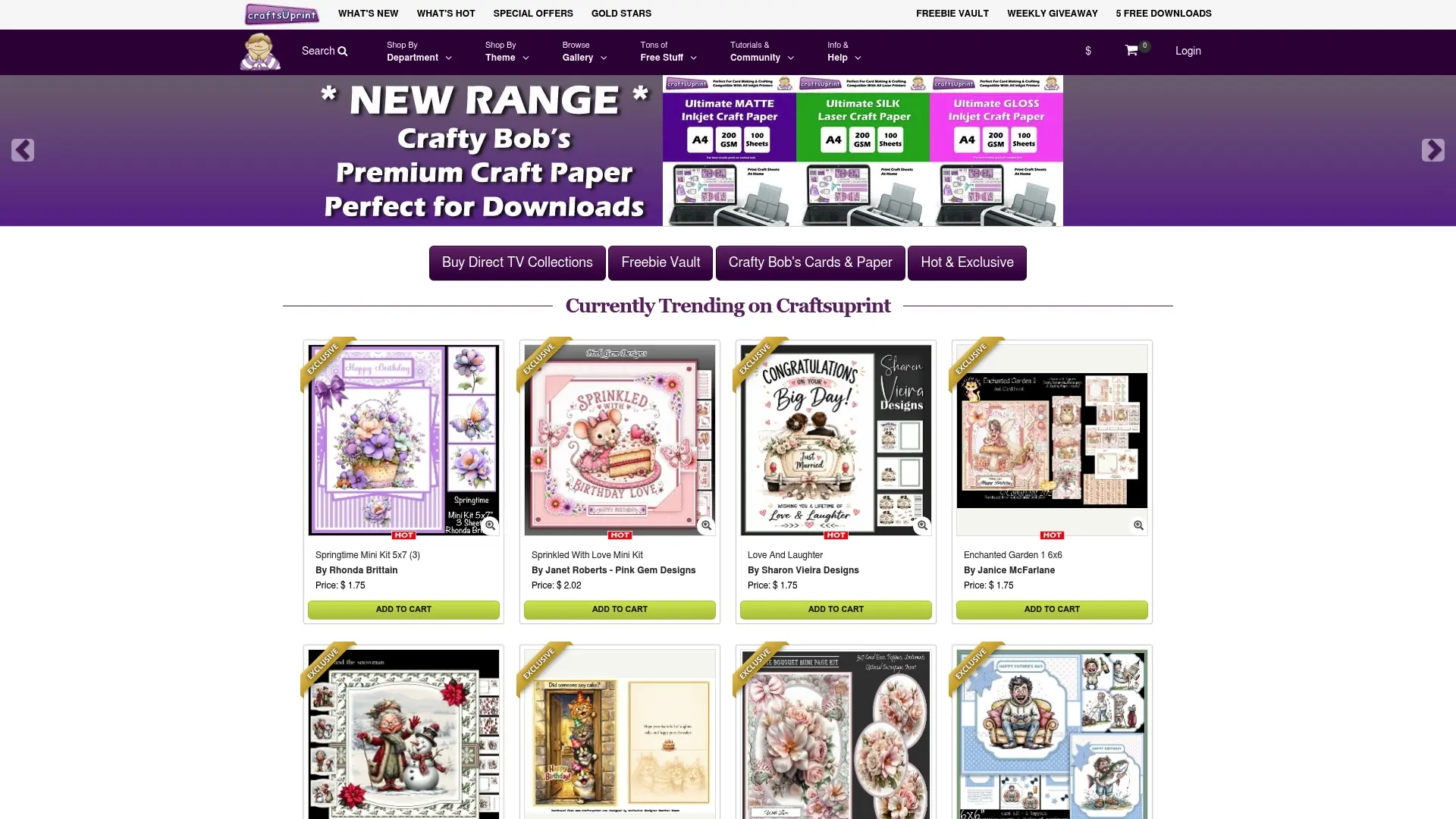
Browse the Card Making range for ready-to-print designs built around exactly this kind of efficient layout, or check Designer Resources for templates and elements you can build your own low-ink projects from. If you’re cutting your own shapes rather than printing full designs, the Cutting Files category pairs well with the same trimming principles. Pick a design, check the preview against your printer settings, and run your usual one-sheet test before committing to a full batch.
Sources
- Ecofont — Wikipedia
- Sustainability (MDPI) — study on Ecofonts and ink/toner savings
- HP Instant Ink service — HP (GB)
- Gov
FAQ
How can I reduce printer ink consumption for craft printables?
Set your printer to draft or low-resolution mode, switch to grayscale for text-heavy elements, and lay out several designs per sheet instead of printing one at a time. Combining two or three of these changes together, rather than relying on just one, tends to produce the biggest drop in ink use.
How do I print without wasting ink on test runs?
Always print one test sheet at your chosen settings and check it against the design before running a full batch. This single habit prevents the most common source of wasted ink: discovering a colour or alignment problem after twenty sheets are already printed.
How do I use less ink when printing on an HP printer?
Lower the print quality to draft or EconoMode in the HP driver, found under the print settings or preferences menu, and select grayscale for non-colour elements. Frequent HP users who print often may also find a page-based subscription like HP Instant Ink works out cheaper per page than buying cartridges individually.
Can I “trick” a printer into using less ink from a cartridge?
There’s no reliable trick that safely extends a genuinely empty cartridge, and forcing one can damage the print head. The legitimate way to cut ink use is through settings, not workarounds: draft mode, grayscale, lighter fonts, and layouts that reduce printed area all genuinely lower consumption without risking the printer.
Does Craftsuprint sell ink-saving printables specifically?
Craftsuprint doesn’t sell ink as a product, but many of its downloads in categories like Card Making are designed with layouts and fills that print efficiently once you apply the driver settings covered in this guide. Current prices for individual downloads and kits are listed on the site itself.