
Ten minute checklist for crafters to fix dark printables

Most printables come out too dark because your screen is brighter than paper will ever be. Monitors emit light at 250 to 350 cd/m², while a print sitting under normal room lighting reads at closer to 80 to 120 cd/m². Drop your screen brightness to a moderate level, re-export the file as sRGB with the colour profile embedded, and run a one-page test print. The rest of this guide explains why that works and what to check if it doesn’t.
TL;DR:
- Reducing monitor brightness to 80–120 cd/m² often corrects dark prints without further adjustments.
- Embedding an sRGB profile at 300 DPI and matching your paper type in printer settings minimizes tonal shifts.
- Calibration with a hardware device and soft-proofing before export greatly reduces the risk of dark, oversaturated prints.
- Ink saturation and density settings should be lowered by 10–15% for matte or absorbent paper to prevent excess darkness.
- Environmental factors like high humidity or damp paper can cause inconsistent or darker prints, so let paper acclimate before printing.
Table of Contents
- Ten-minute checklist to try now
- How do you know if it’s the monitor, the file, the printer, or the paper?
- The step-by-step fix: calibrate, soft-proof, export, and set the driver
- How to test and confirm the fix actually worked
- Hardware checks: is it a setting or a printer fault?
- Craftsuprint resources for crafters preparing printables
- Ink saturation settings and adjustment
- Cleaning and maintenance of printheads to prevent over-inking
- Software troubleshooting for unexpected dark prints
- Does humidity or temperature affect how dark a print looks?
- A practical note on expectations: screen looks versus print fidelity
- Print-ready designs that skip the guesswork
- Sources
- FAQ
Ten-minute checklist to try now
Before you touch any editing software, run through this. It solves the problem for most people without a single pixel being edited.
- Turn your monitor brightness down to a moderate level, and switch off Night Shift, True Tone, or f.lux, which quietly shift both brightness and colour warmth without telling you.
- Print one test page and write down exactly what you changed. Don’t change two things at once, or you won’t know which one fixed it.
- Open the printer driver and set the paper type to match what’s actually loaded in the tray, then turn off any “auto enhance” or “vivid colour” toggle.
- Re-export your file as sRGB, 300 DPI, with the ICC profile embedded rather than stripped out.
- Look at the print under daylight-balanced light, not under a warm lamp or your desk’s overhead bulb.
Pro Tip: Keep a scrap of each test print with a note scribbled on the back: brightness setting, paper type, export format. After three or four prints, the pattern that’s causing the darkness usually becomes obvious.
How do you know if it’s the monitor, the file, the printer, or the paper?
Isolating the cause matters more than guessing at fixes. Four things typically cause dark prints: monitor brightness, viewing conditions, missing or mismatched colour profiles, absorbent paper stock, and crushed shadow detail, and most of these are fixable inside ten minutes once you know which one you’re dealing with.
Start with the monitor. Screens are active, light-emitting displays; paper is passive and only reflects the light already in the room. That gap is the single biggest reason printables look perfect on-screen and gloomy on paper.
- Ambient light and screen-warming tools mislead you. A monitor set to auto-adjust for a dim room, or running Night Shift, tricks your eye into thinking an image is brighter and warmer than it actually is.
- Missing or wrong colour profiles cause tonal shifts. A file with no embedded profile, or one exported in Adobe RGB when the printer expects sRGB, often prints darker and more saturated than intended.
- Paper absorbency changes the result physically. Uncoated or matte stock soaks up more ink than coated paper, a phenomenon called dot gain, and it visibly deepens shadows and midtones.
- Crushed shadow detail hides in the file itself. Check your histogram. If pixel data is piled against the far left edge, those shadows were already losing detail before the file left your screen.
Statistic callout: Reducing monitor brightness by roughly half, from a typical 250 to 350 cd/m² down toward the 80 to 120 cd/m² range recommended for print evaluation, is often enough on its own to make a print look correct again.
The step-by-step fix: calibrate, soft-proof, export, and set the driver
Work through these in order. Each step narrows down where the darkness is actually coming from.
- Calibrate your display. Reduce brightness, set the white point to D65 (6500K), and aim for gamma 2.2. A basic hardware calibrator from a brand like Calibrite or Datacolor costs roughly a low hundred pounds and pays for itself the first time it stops you re-editing a finished design from scratch.
- Soft-proof before you export. In Photoshop, go to View > Proof Setup and simulate your paper’s colour response. Non-Photoshop users can approximate this by viewing the file at reduced brightness and comparing it against a printed swatch.
- Export cleanly. Save as sRGB, embed the profile, and set 300 DPI. Skip ad-hoc CMYK conversion unless a print supplier has actually given you a press profile to convert against.
- Check the printer driver. Set paper type to match the exact stock loaded, leave ink or toner density on default, and switch off “image enhancement” and “auto brightness” features that quietly darken output.
- Adjust for your paper stock. Brighten images slightly before printing on matte or uncoated paper, and reach for coated stock when a design depends on deep, clean blacks.
Pro Tip: If you only have a PDF and no source file to hand, tools like Smallpdf or macOS Preview let you nudge brightness and contrast directly on the PDF itself, which is faster than rebuilding the design.
How to test and confirm the fix actually worked
Print a small tonal patch alongside a cropped section of your actual design. That combination shows you both flat colour behaviour and real detail in one page.
- Change only one variable per test print (monitor brightness, a driver setting, paper stock, or export format), and note the result before changing anything else.
- Follow the one small change rule: isolate a single variable per print run so you can trust what actually fixed it.
- Judge every print under daylight-balanced lighting, and photograph each one under the same light if you want a side-by-side record.
- If prints still look wrong after working through the checklist, ask a professional print lab for an ICC profile or a proof; that’s usually a sign the mismatch sits with your specific printer’s colour behaviour rather than your settings.
Hardware checks: is it a setting or a printer fault?
Uniform darkness across every page, a grey haze over whites, or streaking that follows the paper feed direction all point to hardware rather than software.
- Run the printer’s built-in test page. If that page is also too dark, the problem sits with the printer, not your file or export settings.
- Gently check that the toner cartridge or ink drum is properly seated. Don’t force anything or attempt aggressive internal cleaning, which risks spills or damage.
- Use the printer’s own calibration or cleaning utility first; most consumer models have one built into the driver software or on-device menu.
- If the test page stays dark after cleaning and reseating, contact the manufacturer or supplier rather than continuing to strip the unit down yourself.
Craftsuprint resources for crafters preparing printables
Practical guides specifically addressing this problem are published, because print mismatches cost crafters time and materials they’ve already paid for.
- The printer settings for card printables guide walks through paper media settings that prevent both jams and unwanted darkening.
- The 300 DPI baseline for printables guide explains when 300 DPI is essential and when 150 DPI is genuinely fine.
- The printable templates guide covers how print-ready templates are built to reduce the exact mismatch risk this article addresses.
Ink saturation settings and adjustment
Ink saturation controls how much colour the printer lays down per pixel, and pushing it too high is one of the quieter reasons a design darkens the moment it leaves the screen. Most driver panels hide this under a “colour” or “advanced” tab, often labelled saturation, intensity, or ink density.
Default saturation settings are usually calibrated for glossy photo paper, which handles heavy ink loads well. Load a matte or textured cardstock instead, and that same saturation setting can look noticeably heavier once absorbed.
If your test prints look correct in hue but too heavy overall, drop saturation by 10 to 15% before touching anything else in the file. This targets the actual mechanism causing the darkness rather than compensating for it by lightening the whole image, which can wash out colours that were already correct.
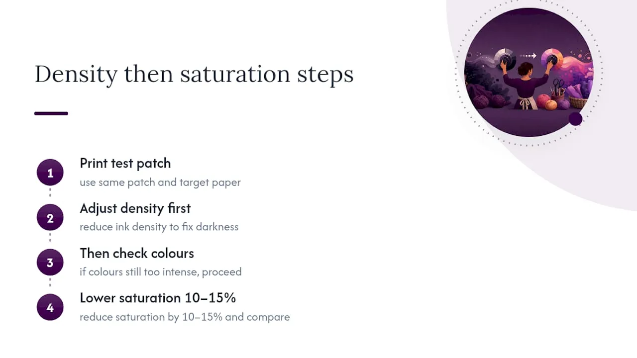
Some printer software separates saturation from ink density entirely; density affects how much ink is applied per area regardless of colour, while saturation affects colour intensity specifically. If your driver offers both, adjust density first, since that’s the setting more directly tied to how dark a print looks overall. Only touch saturation afterwards if colours still look oversaturated once density is corrected. Test one change at a time, exactly as with brightness and paper type, and keep the same test patch so results are comparable.
Cleaning and maintenance of printheads to prevent over-inking
A dirty or partially clogged printhead doesn’t just cause streaks. It can lay down ink unevenly, which often reads as patchy over-inking that looks like a darkness problem rather than a maintenance one.
Run your printer’s built-in printhead cleaning cycle if a test page shows banding, uneven density, or blotches that weren’t in the original file. Most inkjet drivers include this under a maintenance or utilities menu, and it’s a safe, reversible first step that doesn’t require opening the printer.
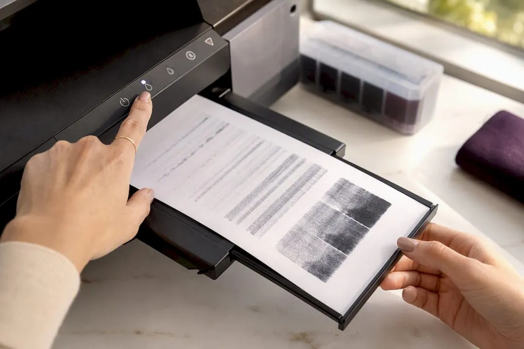
Avoid running cleaning cycles excessively, though. Each cycle uses ink to flush the nozzles, and repeated cleaning without addressing the underlying cause (often just infrequent use) wastes ink and can, in rare cases, push the printhead toward premature wear. If a single cleaning cycle doesn’t resolve blotchy over-inking, run the alignment utility as well, since a misaligned head can double-lay ink in overlapping passes.
For printers that sit unused for weeks between craft projects, that infrequent use is often the real cause of clogging. Ink dries in the nozzles between sessions. Printing a simple test page every week or two, even when you’ve got nothing to print, keeps ink moving through the nozzles and reduces the chance of over-inking or blotching turning up mid-project. If cleaning cycles and alignment don’t fix persistent over-inking after two or three attempts, that’s a sign the printhead itself may need replacing rather than cleaning, particularly on printers with a separate replaceable head.
Software troubleshooting for unexpected dark prints
Sometimes nothing about your hardware has changed, and a printable that printed perfectly last month suddenly comes out dark. That points to software, not the printer or paper.
Check for a recent driver update first. Manufacturer driver updates occasionally reset custom settings back to defaults, silently reactivating “auto brightness” or “image enhancement” toggles you’d previously switched off. Brother’s own support documentation lists checking colour mode and toner-save settings in the driver as the first troubleshooting step when printed output no longer matches the screen, and that advice holds regardless of manufacturer.
Also check whether your design software itself has updated. Colour management settings inside applications like Photoshop, Affinity Photo, or Canva can shift after an update, especially around how a file’s embedded profile gets interpreted at export. If a printable that used to print correctly now comes out dark, re-check your export settings from scratch rather than assuming the file itself changed.
Operating system updates cause the same problem. Windows and macOS both occasionally reset colour management preferences or re-enable a warming feature like Night Shift during a major update, quietly reintroducing a problem you’d already solved once.
The fix in every case is the same: don’t assume the cause, isolate it. Re-run the ten-minute checklist from the top of this guide, because a working setup that suddenly breaks has almost always had exactly one thing change underneath it.
Does humidity or temperature affect how dark a print looks?
Yes, and it’s one of the least obvious causes on this list. Paper absorbs moisture from the air around it, and humid conditions make paper fibres swell slightly, changing how ink or toner sits on the surface.
In an inkjet printer, high humidity means paper absorbs ink more slowly and unevenly, which can produce patchier, sometimes darker-looking results, particularly on absorbent cardstock. In a laser printer, humidity affects how well toner fuses to the page, and damp paper can cause toner to sit less crisply, reading as slightly duller or heavier in tone.
Cold rooms cause a related problem. Paper stored somewhere cold and then fed straight into a printer can cause toner to fuse unevenly, since laser printers rely on heat to bond toner to the page. Letting paper acclimatise to room temperature for an hour before printing avoids this entirely.
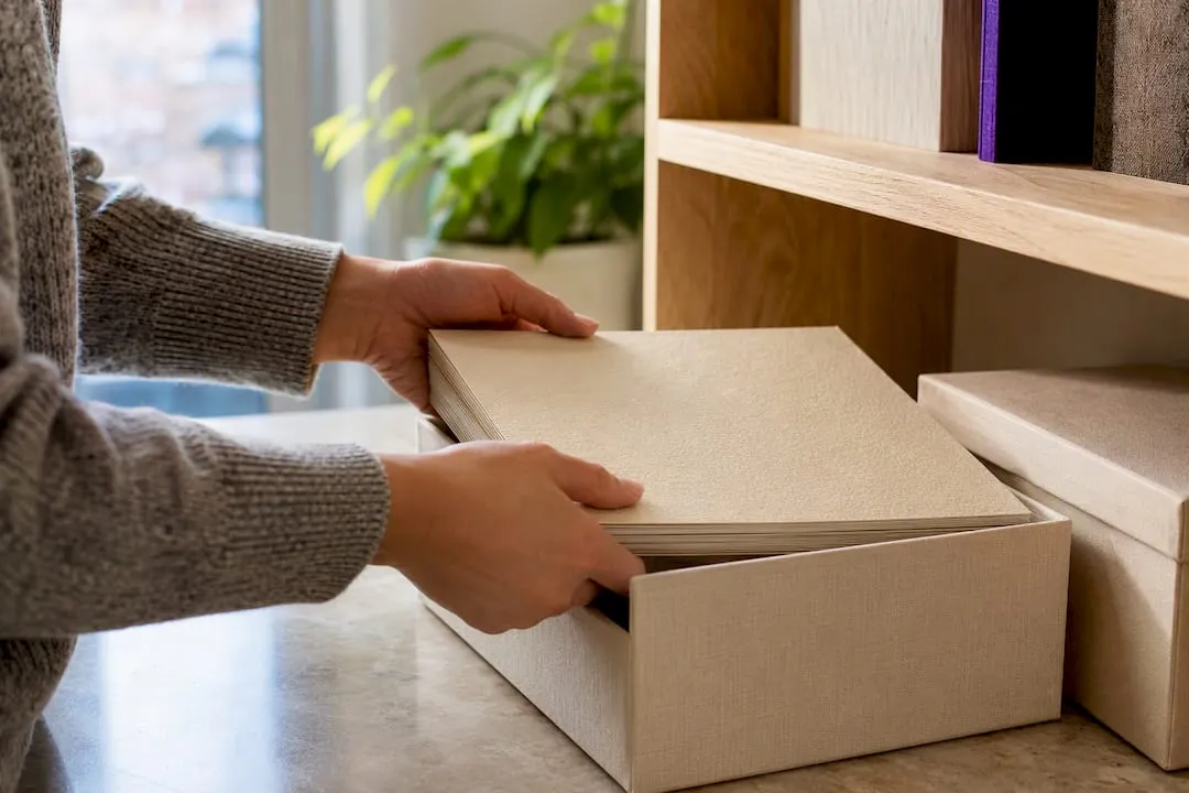
If your prints vary in darkness between sessions despite identical settings, check whether your paper stock has been sitting somewhere damp, like a garage or a room near a kitchen, before you chase a settings problem that isn’t actually there.
A practical note on expectations: screen looks versus print fidelity
Files edited for punchy screen contrast often need flattening before they’ll print well. A screen can display deep blacks and bright highlights simultaneously in a way paper simply can’t reproduce.
Accepting a slightly flatter look on-screen, in exchange for retaining visible detail in printed shadows, is usually the better trade. Chasing an exact screen match on paper often means losing texture in the darkest areas entirely, since lifting the black point to keep some detail above roughly 10% luminance tends to produce a more satisfying physical result than a print that matches the monitor pixel for pixel.
Always proof a full run before committing paper and ink to it. Screen inspection alone, however careful, misses things a physical test print catches immediately.
— Rob
Print-ready designs that skip the guesswork
Working through calibration, soft-proofing, and driver settings is worth doing once properly, but not everyone wants to trial-and-error their way through it on every project. Craftsuprint’s marketplace exists partly for that reason: browsing Create & Craft downloads gets you card kits and paper patterns built by designers who’ve already accounted for how ink behaves on typical craft stock, so there’s less rework between screen and finished card.

That said, ready-made files won’t rescue a printer with a clogged head or a monitor running at full brightness. The hardware and display checks earlier in this guide still matter regardless of whose design you’re printing. If you’re choosing paper stock to pair with a new download, the craft supplies section is worth a look before you commit a full print run to something absorbent enough to darken your design unexpectedly. Browse the current downloads, pick a design that suits your next project, and run one test page before printing the full batch.
Sources
- Professional printing services — screen calibration
- Why do my prints look too dark? Causes & fixes — Printkeg
- Printer prints too dark? Fix black/dark prints & toner settings fast — Whizz-Tech
FAQ
Why are my prints coming out too dark?
Usually because your monitor is far brighter than a printed page can ever be, though missing colour profiles, absorbent paper, and printer driver settings like auto-brightness can all contribute too.
How do I make my prints brighter?
Increase the black point slightly so shadows retain a little detail rather than crushing to solid black, and check whether your paper is absorbent matte stock, which naturally darkens ink more than coated paper.
Why are my photo prints too dark specifically?
Photos often carry more shadow detail than illustrated printables, so crushed blacks and missing ICC profiles show up more obviously. Running a soft proof before export catches this before it reaches paper.
Does the type of paper really change how dark a print looks?
Yes. Uncoated or matte paper absorbs more ink than coated stock, a process called dot gain, which visibly deepens both shadows and midtones on the finished print.