
Cut Reshoots: Photograph Handmade Cards with a 5 Shot Listing Set
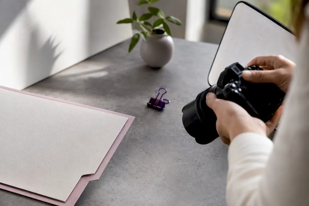
The quickest way to photograph handmade cards is diffused side light from a north-facing window, a tripod, and a multi-image shot list, checked against a grey card for accurate colour. That set covers the front, the open interior, the back, a close-up detail and a scale shot. Get those five right and consistent, and the rest of your listings fall into place.
TL;DR:
- Consistently capturing five specific shots—hero, interior, back, detail, and scale—is essential for clear and comprehensive handmade card listings.
- Using diffused side lighting from a north-facing window or soft LED panels ensures textures and finishes like embossing or foil are accurately represented.
- Proper staging with neutral backgrounds, minimal props, and careful angle control prevents distractions and maintains uniformity across multiple photos.
- Shooting with a tripod in manual mode, locking focus and exposure, and using a grey card for white balance drastically reduces post-editing corrections needed.
- Basic editing should focus on white balance and minimal enhancements; avoid overexposure or saturation boosts that can distort the card’s true appearance.
Table of Contents
- How do I photograph handmade cards for a listing?
- Lighting basics and a quick 10-minute lighting test
- Choosing backgrounds and props that don’t compete with the card
- How to photograph foil, gloss and embossed finishes
- Camera and phone settings that stop blur and colour drift
- Editing workflow that keeps colours true to the original
- Building a repeatable workflow for a whole range
- When DIY photography is enough, and when to bring in help
- Templates and supplies that make staging faster
- Sources
- FAQ
How do I photograph handmade cards for a listing?
Buyers can’t touch your card, so your photographs have to answer every question they’d ask if it were in their hands. That means showing the front design straight on, the interior message, the reverse with any maker details, a close-up of the finish, and something that gives a sense of scale. Miss one of these and you’ll field the same question in your inbox a dozen times.
Here’s the shot list that covers it, based on guidance from the Greeting Card Association and further shot-list breakdowns aimed specifically at sellers:
- Hero shot – card square to the camera, lens level with the centre of the card to avoid distortion.
- Open/interior shot – only if the inside carries a design, verse or hand-finished element worth showing; skip it for blank-inside cards.
- Back and envelope shot – shows maker details, card stock weight, and the envelope included.
- Detail shot – tight crop on embossing, glitter, layering or stitching.
- Scale or in-hand shot – held in a hand or next to a ruler, plus an optional restrained lifestyle shot (propped against a mug, on a desk) for social media.
Lighting basics and a quick 10-minute lighting test
Side light beats front-on light every time for handmade cards, because it reveals texture instead of flattening it. A north-facing window works well for natural light. If daylight isn’t reliable where you shoot, two soft LED panels angled at 45 degrees either side of the card do the same job.
Shape the light with cheap tools rather than buying more of it:
- A white foam-board reflector bounces light back into shadows without adding a second light source.
- A small piece of black card, held just out of frame, kills unwanted reflections on glossy or foiled areas.
- A diffuser, even a bedsheet over a window, softens harsh midday sun into something workable.
Before you shoot a whole range, run the test recommended by the Tiny Box Company: place a grey card in frame, set white balance from it, take three exposures a stop apart, then check foils, glitter and embossing at 100% zoom for colour shift or blown highlights. Ten minutes here saves an afternoon of reshoots later.
Pro Tip: Keep a cheap grey card in your camera bag permanently. Photograph it for two seconds at the start of every session, and you’ve got a fixed reference point to fix white balance across the whole shoot in one click.
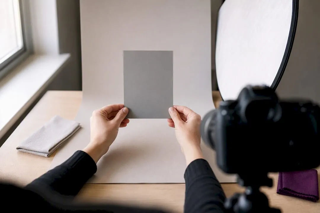
Basic kit list: tripod, a diffuser or reflector, a grey card, and a lint-free cloth to keep the card and lens dust-free.
Choosing backgrounds and props that don’t compete with the card
The background’s job is to disappear, not to compete for attention. Light grey card, pale timber boards, or plain stone tile all work because they don’t bounce strong colour onto the card’s surface, which a bright red or blue backdrop will do within seconds.
Prop rules worth following:
- Pick one focal prop maximum, on theme, and keep it smaller than the card itself.
- Stay away from busy patterns or anything with visible branding.
- Match props to the card’s occasion (a sprig of eucalyptus for a wedding card, not a Christmas bauble).
For repeatability, mark your camera and card positions with washi tape or a pencil dot on the surface below, drawn from practical shoot planning advice at Loxleys. Inexpensive backdrops and props can come from homeware shops with a minimalist range, and Templates and printable backgrounds can double as staging backdrops for flat-lay shots.
How to photograph foil, gloss and embossed finishes
Foil and gloss are the two finishes that ruin more product photos than anything else, usually because sellers try to fix glare by raising exposure. That washes out the highlight and flattens the shine instead of showing it off. Change the angle of the card, or the light, rather than the exposure setting.
- Tilt the card a few degrees until foil catches a clean, narrow highlight line rather than a blown-out patch, following the approach set out by Tog.
- Use raking light, angled almost parallel to the surface, to bring out embossing and debossing.
- Hold a small black card just out of frame to suppress reflections on gloss varnish.
- If your camera or phone supports it, a circular polarising filter cuts glare further.
- Shoot a separate close-up for every special finish. Check it against the physical card for a clean highlight line, visible texture, and no colour shift before moving on.
Camera and phone settings that stop blur and colour drift
A tripod does more for image quality than a better camera. Camera movement is the single biggest cause of soft, unusable product shots, so pair the tripod with a self-timer or remote shutter release, as recommended by the Greeting Card Association.
- Mount the camera or phone on a tripod or clamp; never shoot handheld for listing images.
- Shoot RAW on a camera, or Pro/Manual mode on a phone, and lock exposure and focus manually rather than letting the phone re-meter every frame.
- Drop exposure by around a third to two thirds of a stop for glossy or foiled cards, since auto-exposure tends to overexpose reflective surfaces.
- Use a wide aperture (low f-number) to isolate a single hero card against a soft background, and a narrower aperture when photographing a group of cards so all of them stay sharp.
- Frame the hero shot dead straight on, tilt slightly higher for interior shots to show the fold, and use rule-of-thirds placement for any lifestyle or social shot.
Editing workflow that keeps colours true to the original
Correct the white balance using your grey card shot before you touch anything else. Getting this right first means every other edit, cropping, straightening, cloning out a stray fibre, actually lands on accurate colour rather than compounding an error.
- Set white balance from the grey card reference frame, then apply the same correction across the whole batch.
- Work from RAW files where possible; they hold far more colour information than a compressed JPEG, so recovery from a slightly wrong exposure is realistic.
- Keep edits minimal: crop, straighten, remove dust or scuffs, and resist the urge to boost saturation, which pushes foils and inks away from how they actually look in hand.
- Export two versions: a high-resolution archive master and a smaller file sized for your marketplace’s upload limits.
- For a print run where colour accuracy really matters commercially, a Pantone drawdown or physical proof is worth the cost; screen calibration alone won’t catch every discrepancy.
A ten-minute lighting test, as noted earlier, catches most colour problems before they ever reach the edit stage, which is far cheaper than fixing them in post.
Building a repeatable workflow for a whole range
Photographing one card is easy. Photographing forty consistently is where sellers lose hours, unless the process is locked down before the camera comes out.
- Prep every card: flatten it under a book overnight if needed, wipe with a lint-free cloth, and set aside a duplicate for test shots so you’re not risking your only stock copy.
- Mark camera, card and light positions with tape, then run one test shot checklist (grey card, white balance, exposure check) before you touch the first real card.
- Shoot the entire range without moving the tripod or lights, an approach the Greeting Card Association points to as the fastest route to a consistent set.
- Name files by product code and shot type as you go, and batch-export with a saved preset sized to your marketplace’s aspect ratio and resolution requirements to avoid re-exporting later.
Consistency across a range isn’t a nice extra. It’s what lets a buyer compare two designs on their merits rather than getting distracted by why one photo looks warmer than the next.
When DIY photography is enough, and when to bring in help
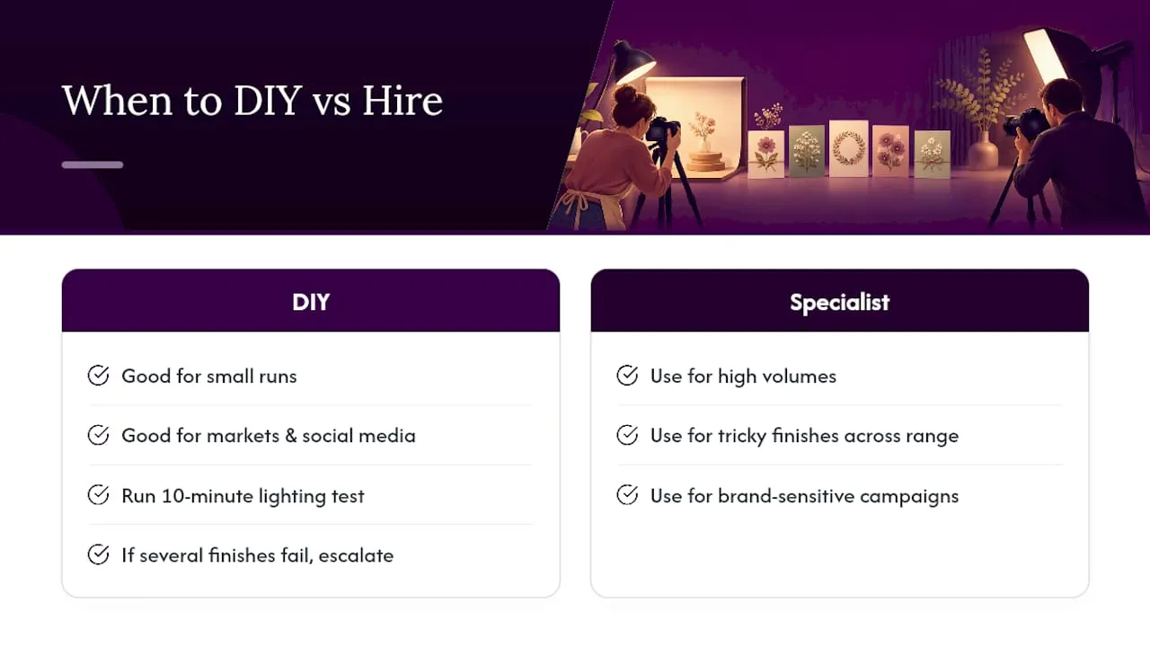
DIY photography, done properly, is genuinely enough for markets, social media and most online shops selling in small runs. Consider a specialist once you’re photographing high volumes, dealing with tricky finishes across an entire range, or shooting a campaign where brand perception carries real weight. Run the ten-minute lighting test first; if several finishes keep failing it, that’s your signal to escalate rather than keep troubleshooting.
Templates and supplies that make staging faster
Half the battle of a good product photo happens before the camera comes out, in the flattening, the propping, the choosing of a background that won’t fight the design. Card-making downloads and printable kits give you consistent stock designs to photograph against, so you’re not reinventing a backdrop every time you shoot a new range.
If you’re building die-cut or novelty shapes for photography, the cutting files library has downloadable patterns that produce clean, repeatable edges, which matter far more under raking light than they do to the naked eye. Browsing the card and paper stock range is worth doing before a shoot too. The right stock weight and finish photographs more predictably than a mismatched one, and it saves you fighting glare in post. For setup advice beyond lighting, a partner guide on practical content creation kit covers tripods, reflectors and backdrops in more depth. Start with one range, run the shot list above, and see how much faster your next batch of listings comes together.
Sources
- How to Photograph Greeting Cards – Greeting Card Association
- How to photograph greeting cards — Practical shot list guidance
- Photography basics: how to shoot foil-stamped products
- Picture perfect greetings — Loxleys
- Sampling that avoids surprises under studio lights — Tiny Box Company
FAQ
How can I make my own photo cards?
Flatten the card, set it near diffused side light, mount your camera or phone on a tripod, and shoot the five-image set: hero, interior, back, detail, and scale. Run a quick white-balance check against a grey card before you start, as recommended in the Greeting Card Association’s guide.
What is the best website for making photo cards?
For sourcing templates, printable backgrounds and cutting files to stage and photograph handmade cards, A card-making category offers downloadable kits and tutorials built for exactly this. It’s a resource for preparing the card, not a photo-editing tool itself.
How can I turn my photos into cards?
That’s a separate process from photographing finished cards: it usually means printing your own photography onto card stock using a home printer or a print-on-demand service, then trimming and folding it. Cutting files can supply the die-cut shapes and templates for that finishing stage.
What are the trends for greeting cards in 2026?
Handmade and personalised cards with tactile finishes, foil, embossing and textured stock continue to sell strongly online, which raises the stakes for photography that actually captures those details rather than flattening them. Sellers who invest in a proper lighting test and consistent shot list stand out precisely because so many listings still show flat, badly lit photos.
Do I need a professional camera to photograph handmade cards well?
No. A modern phone shot in Pro or RAW mode, locked exposure, mounted on a tripod, will produce sale-ready results for most small sellers. Stabilisation and lighting matter more than the camera body, as the Greeting Card Association points out when recommending tripods and shutter releases over camera upgrades.