
How to choose card patterns: crafter's 2026 guide
TL;DR:
- Choosing the right card patterns involves selecting an anchor pattern first to create a harmonious design. Assigning each pattern a specific role—anchor, supporting, or accent—prevents visual competition and achieves balance. Applying the 60-30-10 rule ensures proper color proportions, and precise panel sizing enhances the card’s professional appearance. When faced with overwhelming papers, techniques like die-cutting or distressing can transform them into usable elements.
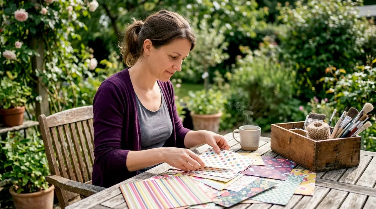
Choosing card patterns is a deliberate design process built on three principles: selecting a bold anchor pattern first, building complementary prints around it, and controlling colour proportions to prevent visual chaos. Whether you are working with PhotoPlay patterned papers, Spellbinders die-cut collections, or printable downloads from Craftsuprint, the same rules apply. Get the anchor right, and the rest of the card falls into place. Ignore it, and even beautiful papers will compete rather than cooperate. This guide walks you through every stage, from understanding what card patterns are to troubleshooting the papers you find hardest to use.
How to choose card patterns: start with the anchor
The single most important decision in selecting card designs is choosing your anchor pattern first. Choosing the anchor panel before layout leads to more harmonious and intentional cards than selecting a layout first and then hunting for papers to fill it. Think of the anchor as the creative director of your card. Every other element reports to it.
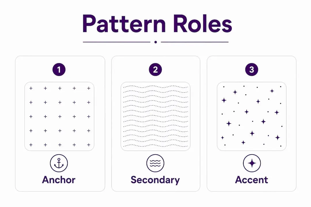
The three pattern roles every card needs
Every well-balanced card assigns each patterned paper a specific job. There are three roles to fill.
- Anchor pattern. This is your boldest, busiest, or most visually dominant print. It sets the colour palette, the mood, and the scale reference for everything else. A standard anchor panel sits at approximately 4" × 5¼", giving it enough presence to lead the design. Bold florals, large geometrics, and statement stripes all work well here.
- Supporting pattern. This print acts as a visual bridge between the anchor and the card base. It should be softer, smaller in scale, or less saturated than the anchor. A tone-on-tone dot, a fine stripe, or a subtle texture all serve this role well. The supporting pattern should never shout. Its job is to carry the eye from one area of the card to another without interruption.
- Accent pattern. This is the smallest element, often appearing in die-cut embellishments, punched shapes, or a narrow strip of paper. It adds detail and interest without competing with the anchor. Keep accent patterns to small surface areas so they punctuate rather than overwhelm.
Assigning distinct jobs to patterns prevents competition and creates intentional design. When two patterns fight for dominance, the viewer’s eye has nowhere to rest. Giving each print a clear role solves that problem before it starts.
Illustrating the roles with a simple layout
Picture a standard A2 card base in white. The anchor panel sits centred, slightly smaller than the card front. A narrow strip of the supporting pattern runs horizontally across the lower third of the anchor. A die-cut butterfly cut from the accent pattern sits in the upper right corner. Each layer is visible, each has a purpose, and none competes with the others. That is the role-based system working exactly as it should.
Pro Tip: Flip your patterned paper over before reaching for a second sheet. The back side of patterned paper often reveals a lighter, less detailed version of the print, which makes a perfect supporting layer or focal image background without requiring an extra purchase.
How do colour harmony and pattern scale affect your choices?
Colour harmony and pattern scale are the two levers that control whether a multi-pattern card looks balanced or chaotic. Coordinated colour families combined with varied pattern scale maintain balance and keep designs from looking accidental. Use both levers together for the strongest results.
The four balancing moves
- Stay within a coordinated colour family. Pull papers from the same collection or select prints that share at least two colours. This creates cohesion without requiring identical tones. A card using dusty pink, sage green, and cream across three different patterns will feel unified because the colours speak the same language.
- Vary the pattern scale. Pair a large-scale print with a small-scale print. A big floral anchor next to a fine dot supporting layer creates contrast and visual interest. Two large-scale prints placed together will compete. Two small-scale prints placed together will blur into visual noise.
- Add a grounding layer. A deeper cardstock base layer anchors foreground patterns and prevents visual overload. A rich burgundy or forest green cardstock beneath patterned papers defines sections and gives the eye a place to rest between busy areas.
- Soften with organic elements. Die-cut foliage, torn paper edges, or layered leaves break rigid geometric lines and add a natural quality that softens even the most structured pattern combinations. Spellbinders leaf and branch dies are particularly effective for this purpose.
The 60-30-10 colour rule explained
The 60-30-10 rule is the most reliable framework for colour proportioning in cardmaking. Aim for approximately 60% dominant colour, 30% secondary colour, and 10% accent colour across the total card surface. This proportion creates a visual hierarchy that feels natural rather than forced.
The table below shows how this plays out on a typical A2 card.
| Colour Role | Proportion | Example Application |
|---|---|---|
| Dominant | 60% | Card base and anchor panel background |
| Secondary | 30% | Supporting pattern strip and mat layers |
| Accent | 10% | Die-cut embellishment or sentiment banner |
Most common design imbalances come from ignoring colour proportions and accidentally oversizing accent elements. When an accent colour creeps up to 25–30% of the card surface, it begins to compete with the secondary colour and the whole hierarchy collapses. If your card feels “off” but you cannot identify why, measure your accent areas. They are almost certainly too large.
Pro Tip: When mixing small and large pattern scales, also mix light and dark values within those scales. A large light-toned floral paired with a small dark-toned geometric creates both scale contrast and value contrast, giving the card a professional depth that single-value combinations rarely achieve.
What are the best practices for layout and sizing?
Precise layout and sizing are what separate a polished card from one that looks slightly wrong despite using beautiful papers. Precise alignment and consistent white-space borders markedly elevate handcrafted card appearance to a professional level. The difference is often less than a millimetre, but the eye detects it immediately.
Standard sizing and panel dimensions
The A2 card format is the industry standard for handmade cards in the UK and US markets. A standard A2 card base measures 4¼" × 5½" when folded. Work to these key panel dimensions:
- Full-bleed anchor panel: 4" × 5¼", leaving a 1/8" border of base cardstock visible on all sides.
- Secondary mat layer: 3¾" × 5", sitting centred on the anchor panel with a visible border.
- Focal image or sentiment panel: sized to fit the design, typically 3" × 3" or smaller.
Leaving a narrow border of base cardstock visible on all sides frames each layer and creates a polished, intentional look. Skipping this border makes layers appear to float without context. Even a 1/8" reveal of cardstock between layers adds structure and definition.
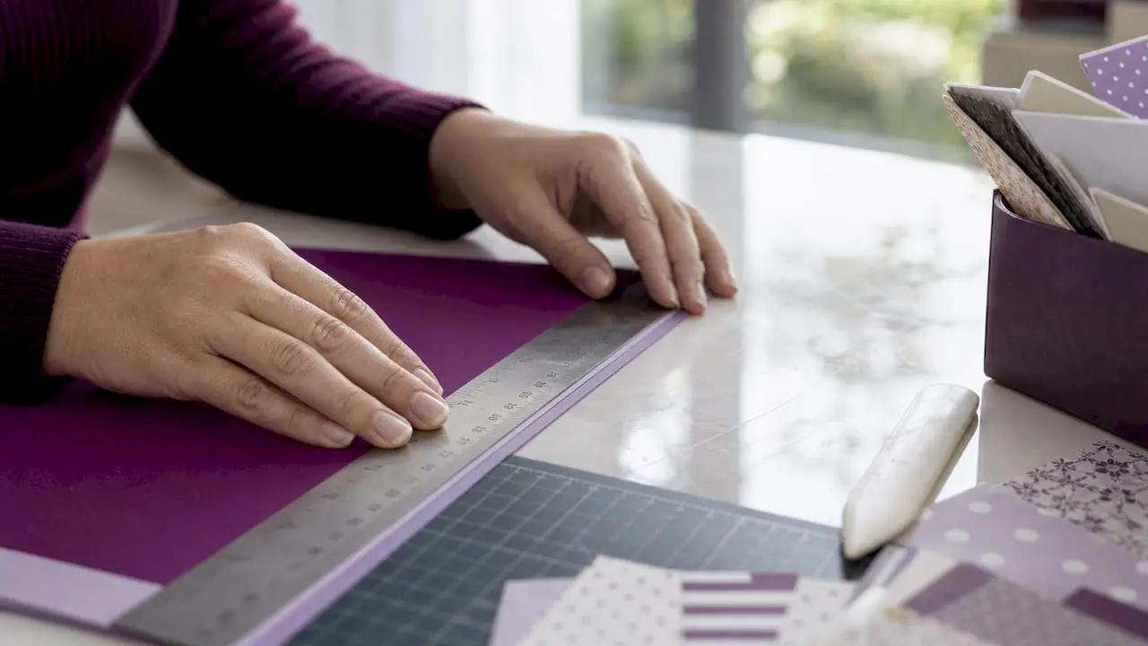
Cutting and alignment precision
Treat patterned paper placement like typography. Small measurement deviations create a visually unbalanced card even when the design itself is strong. A panel cut 1/16" too wide on one side will sit off-centre, and the viewer will sense the imbalance even if they cannot name it.
Use a paper trimmer with a built-in measurement grid rather than a craft knife and ruler for panel cuts. Score boards with clear millimetre markings, such as those from Stampin’ Up! or Tonic Studios, give you the precision needed for consistent results. Cutting and alignment to within 1/16 inch prevents cards looking off despite otherwise strong design choices.
“Start with your pattern selection, then determine your layout. Never work backwards from a pre-set layout and try to force papers into it. The pattern leads; the layout follows.”
Pro Tip: Before adhering any layer, place it dry on the card and measure the border on all four sides with a ruler. Adjust until all borders are equal. This takes thirty seconds and prevents the frustration of peeling off adhered layers.
You can find more guidance on precise placement in this card templates guide from Craftsuprint, which covers layout planning in detail.
How can you use patterned papers you find overwhelming?
Every crafter has a stack of patterned papers they bought with enthusiasm and now avoid. The pattern is too busy, the colours feel wrong, or the scale is simply too large for the cards they make. These papers are not wasted. They need a different approach.
Techniques for transforming difficult papers
- Use die cuts to create pattern windows. Breaking up busy prints with die cuts transforms overwhelming patterns into balanced backgrounds. A large floral that feels chaotic as a full panel becomes charming when viewed through a scalloped circle or a decorative frame die. The die cut isolates the most attractive portion of the print and removes the visual noise around it.
- Stamp directly onto the patterned paper. Adding a stamped image on top of a busy pattern creates a new focal point that draws the eye away from the chaos beneath. Stamping on patterned paper then die-cutting the result creates a coordinated embellishment that integrates the pattern rather than fighting it.
- Crumple or distress the paper for texture. Gently crumpling a sheet of patterned paper and then flattening it softens the print by breaking up its regularity. The distressed surface catches light differently, reducing the visual intensity of a busy pattern. Ink the edges with a coordinating distress ink, such as Tim Holtz Distress Oxide, to further soften the effect.
- Use it as a dimensional background. Tear the paper into strips or irregular shapes and layer them across a card base to create a collage-style background. No single area of the pattern dominates, and the torn edges add texture and depth.
The key to all these techniques is altering scale perception using die cuts or texture to minimise visual noise. You are not hiding the pattern. You are reframing it so the viewer sees what you want them to see.
Pro Tip: Repeat one colour from the difficult paper in your cardstock base, ribbon, or sentiment ink. Colour repetition creates a visual connection between the transformed pattern and the rest of the card, making the whole design feel intentional rather than accidental.
Explore more ideas in Craftsuprint’s guide to creative crafting techniques for transforming your projects.
Key takeaways
Choosing card patterns successfully requires assigning each paper a clear role, controlling colour proportions with the 60-30-10 rule, and cutting panels with precision to within 1/16 inch.
| Point | Details |
|---|---|
| Anchor pattern first | Select your boldest print before planning the layout to build a harmonious design. |
| Assign pattern roles | Give each paper a job: anchor, supporting, or accent, to prevent visual competition. |
| Apply the 60-30-10 rule | Use 60% dominant, 30% secondary, and 10% accent colour to maintain clear hierarchy. |
| Cut with precision | Align panels to within 1/16 inch and leave consistent narrow borders for a polished finish. |
| Rescue difficult papers | Use die cuts, stamping, or distressing to transform busy or disliked prints into usable layers. |
Pattern selection: what years of cardmaking taught me
The advice that changed my cardmaking most was the simplest: give every pattern a job before you pick up the scissors. Before I understood pattern roles, I would pull three or four papers I liked and try to make them work together. Sometimes it came off. More often, the card felt restless and I could not explain why. Once I started choosing the anchor first and asking what role each subsequent paper would play, the whole process became faster and the results became more consistent.
The 60-30-10 rule sounds like interior design theory, and it is. But it works just as well on a 4¼" × 5½" card as it does in a living room. The moment I started checking whether my accent elements had crept past that 10% threshold, I stopped making cards that felt “almost right” and started making cards that felt finished.
Precision cutting is the part most crafters underestimate. I spent years wondering why some of my cards looked slightly amateur despite using the same papers as makers whose work I admired. The answer was alignment. A panel sitting 2mm off-centre reads as careless even to someone who cannot articulate why. A scoring board and a good paper trimmer are not luxuries. They are the tools that make the difference between a card that looks handmade and one that looks hand-crafted.
On the subject of difficult papers: stop avoiding them. The crumpling technique alone has rescued more papers from my “never use” pile than any other method. The distressed surface changes the character of the print entirely. What felt garish flat becomes interesting with texture. Give those papers a second chance with a die cut or a stamp, and you will be surprised how often they become your favourites.
— Rob
Find your next favourite pattern on Craftsuprint
Applying these pattern selection principles is far easier when you have the right papers and templates to hand. Craftsuprint offers an extensive range of printable patterned papers and card supplies covering every style, from delicate botanicals to bold geometrics, all sized and formatted for immediate download and printing.
If you are new to digital craft downloads, the free Create & Craft Members Gift is the best place to start. You get downloadable templates and pattern resources at no cost, giving you the chance to practise the layout and sizing techniques covered in this guide before committing to a full purchase. Browse the full Craftsuprint catalogue and find the anchor pattern your next card has been waiting for.
FAQ
What are card patterns in cardmaking?
Card patterns are patterned papers or printed designs used as decorative layers in handmade cards. They include florals, geometrics, stripes, and textures, each serving a specific visual role within the card design.
How do i pick the right anchor pattern for my card?
Choose the boldest or most visually complex paper in your selection as the anchor. It should set the colour palette for the entire card, with all other patterns chosen to complement rather than compete with it.
What is the 60-30-10 rule in card design?
The 60-30-10 rule divides card colour into 60% dominant, 30% secondary, and 10% accent. Oversized accent areas of 25–30% disrupt the hierarchy and make cards feel unbalanced.
How do i combine different pattern scales on one card?
Pair a large-scale print with a small-scale print to create contrast and visual interest. Mixing small and large pattern scales alongside light and dark colour values gives cards a professional depth.
What should i do with patterned paper that feels too busy?
Use a die cut to isolate a small section of the print, or distress the paper by crumpling it to reduce visual intensity. Die cuts and distressing transform overwhelming patterns into balanced, usable design elements.